

Design and Product Overview
A knowledge-Sharing Collaborative Platform for NYU IT Community
Virtual Torch Tech is a website that focuses on fostering collaboration, knowledge sharing, and network building among the NYU Information Technology community. Since the current design of VTT could not meet the user’s needs, so NYU IT plans to design the next generation’s Virtual Torch Tech and help the user to have a better experience on VTT. There are two features for NYU Virtual Torch Tech, first is give NYU IT employees to have a place to ask and answer questions, second is allow users to create groups, add members, share documents and resources and chat with group members privately.
Process Overview

My Role
NYU Virtual Torch Tech is a project which cooperates with many designers. After I take over this project, I mainly responsible for integration work. I adjusted the layout of the NYU Virtual Torch Tech to make sure every page has a consistent framework that helps developers develop efficiently. I also designed the mobile version for NYU Virtual Torch Tech and design guidelines to assist the developers in building a component library for developing. I participated actively in user research for NYU Virtual Torch Tech phase two and collecting the feedback from users for further enhancement for the user experience and design of NYU Virtual Torch Tech.
Product Related
Team | Product manager: Sarth Desai / Developer: Rayat Rahman, Sarah Pierce / UX Designer I (Maria Shin, Yu Hsuan Lin), UX Designer II(Vidia, Mianying Chen), UX Researcher (Hua Yuan),Illustrator(Yu Hsuan Lin)
Department | NYU Information Technology
Duration | 12 months
User | NYU Information Technology Community
Research Method | Contextual Inquiry, Heuristic Evaluation, User Interview, Persona, Usability Testing
User Flow

Prototype of NYU Virtual TorchTech
Click the image below to test the interactive prototype.
Early-Stage Design Overview
Before I join the team, our team already finish the discover, heuristic evaluation, research, design, and usability testing step. I will summarize our team's previous work shortly here. Then, comparing the design between the last group and me in the next part.
NYU TorchTech Website Heuristic Evaluation
First of all, the previous team did the heuristic evaluation for the last VTT website to understand all the problems. They believe one of the most serious issues is that the site is lack of interactivity. And they think there is even no heavy user for the website.

Other than the Torch Tech website, NYU IT facilitated communities of practice to bring NYU people who share the same interest/skill. However, the site is also lack of interactivity which means users cannot easily discuss with group member through the platform any time anywhere.

Persona
Based on the 1:1 interviews with 6 people worked at NYU IT, The previous group basically divided the user into 2 groups: IT-professional and Non-IT Professional, as these 2 types of people behave differently and also have different goals. Both of these two user groups are interested in having a digital space to share or access tech knowledge. Also, they would like to have a place make networking easier.


Understand Users’ Intentions
The previous conducted first focus group sessions to understand users’ intentions. Based on their feedback, their expectations and intentions can categorize into four categories: knowledge-sharing, networking, events, and projects. (Yuhsuan Lin and Maria Shin) introduced the rainbow sheet analysis method to the team, and this helped my team better understand users’ intentions.

Information Architecture
Based on the rainbow sheet and the evaluation of previous website, the previous team defined 5 main features: Knowledge-sharing, Networking, Events, Projects and Community of Practice for VTT.

Low-Fi Prototype
The previous team created the wireframe based on the research they did to discuss with the stakeholders to better understand what kind of information they want to know.

Design Iteration
After I take over this project, I checked all the previous design and research, and talked with the development team in the prior design, then spoke with our product manager with the problem that previous NYU VTT has. I categorized three big topics that I think has the problem, which is features, consistency, detail/logic.
Feature
The previous team defined five main features for NYU VTT, which are knowledge-sharing, networking, events, projects, and Community of Practice. Besides these five main features, there is a profile page that allows the user to manage their personal information. However, the development team thinks it is too difficult to develop all five features for VTT at phase one. I also believe there are some overlaps between different functions. For example, users do not need a networking page to connect with other people. They can search people though search bar and find the people they want to connect, then jump to the profile page for the people they interest. Based on the consideration I listed above, I discussed with my product manager then decided to focus on Knowledge-sharing, Community of Practice, and Profile these three features for VTT. The chart below is the new information architecture.

Consistency
The consistency was the first problem I noticed from the previous design, It not only brought difficult for the development team to develop the platform, but also let the user have an inconsistent user experience across different page, the consistency problem, including spacing, components, color, and font style.
1. Spacing
For the previous design, the spacing between different modules and content were different. I checked all the page, and make sure the spacing between each module is consistent.

2. Components
There are different types of the component in NYU Virtual Torch Tech, which include Tag, Button, Tab etc. The previous design did not have a standard for each component which brings the inconsistent user experience for the user. For the new design, I created a guideline for each component, the help developer and user more comfortable to operate and develop this system. Below is the part of the example for tag, button and contract member component.


3. Color and accessibility
The color in the previous design is chaotic. It took me a long time to make sure the color for each component is consistent, and pass the WCAG 2.0 AA accessibility test. Then I created a design guideline to help developer apply the color into the component library development.


4. Font style
The previous design did not define the font style, and the inconsistent of font style exist everywhere on every page. I went through all the page and made sure the font style of same content every page are consistent.


Detail and Logic Improvement
There were many conflicts for the previous design’s design logic after I took over this project, I redesigned many modules, layout, and content based on the usability testing previous team did before, and try to make sure all the components meet user’s requirements and intuition.
Homepage - Question/Post input box
For the design of the Question / Post detail page, the previous model of VTT allowed the user to insert image and highlight specific text, etc. However, the previous design’s question/post input box did not include these features. So, I redesigned the question / post input box to make sure the user has more options to edit their questions and post

Homepage - My feed - Question/Post interactive block
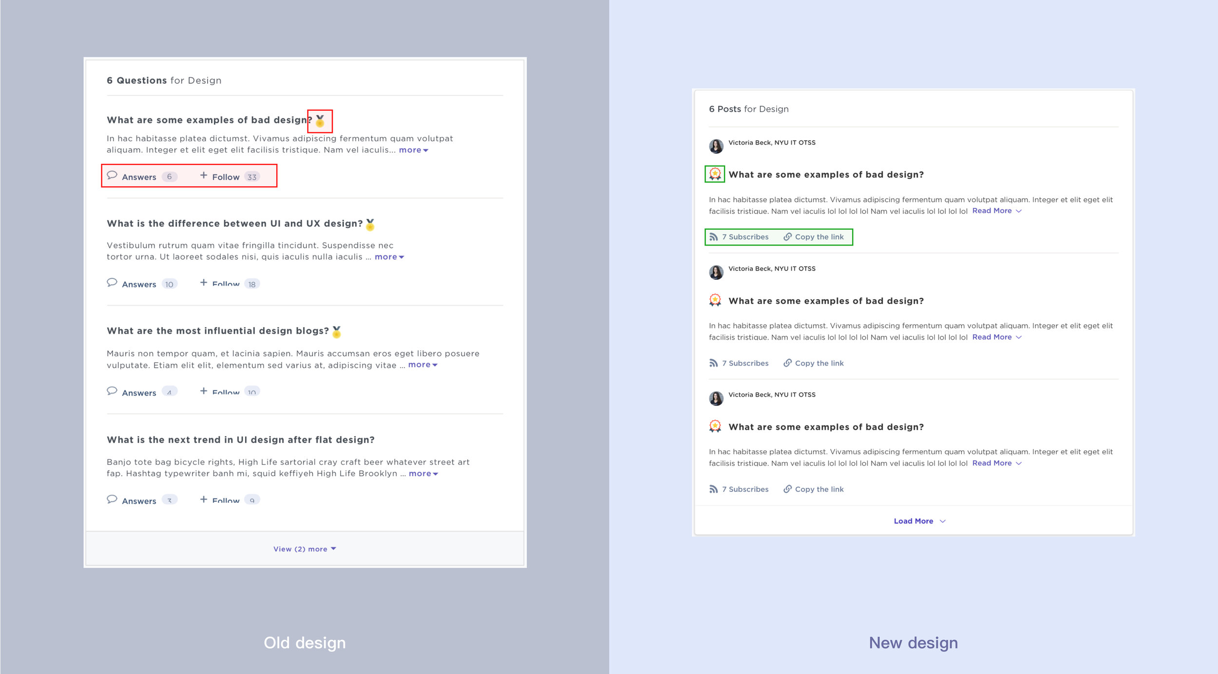
The Question/Post interactive block is the core interaction of the new VTT. However, I think the previous design still had loopholes. For example, The Most Helpful answer does not apparent compared with other solutions; there is nowhere to let the user answer other people’s questions and let question/post publisher select the most helpful answer. There is nowhere to unsubscribe the items/posts and share the question/post with other people, etc. I redesigned the Question/Post interactive block to help the user having a better experience to use the interactive block to join the question/post discussion.

Homepage - Discover - Question / Post recommendation block
The Discover page is a place to help the user to find the new question/post they interest out of their primary interest. However, the previous design did not allow the user to subscribe to the question directly at the question/post recommendation block. For the new design, I added the subscribe feature on the Question / Post recommendation block and also add the tag to let the user know this question/post-match which keyword they selected before.

Page layout
The layout on each page of the previous design is confusing, and sometimes you cannot find the link you need because it placed somewhere you are not expecting. In the new design, I divided all the pages in two or three-column, the left column is the operation area, you can find the button, tag, tab components on it, the middle column is the main content area, and the right column is the footer area.


Search result page - Question / Post
The purpose of the search result page is to let the user using the shortest time to find the search result they need. However, in the previous design, I believe the options under each Question/Post may mislead users, for example, the "Answers" button may let the user think they can reply questions directly at the search result page. So I removed the "Answer" button and used the "Subscribe" button to replace the “Follow” button to help the user get the Question and Post they need more fast and accessible.
Final Design and Design Vertification
After I conduct all the problem for the previous VTT’s design and confirm with our product manager, I curve the design of VTT and create a responsive version with another designer — Vidia.
First Time Log-in
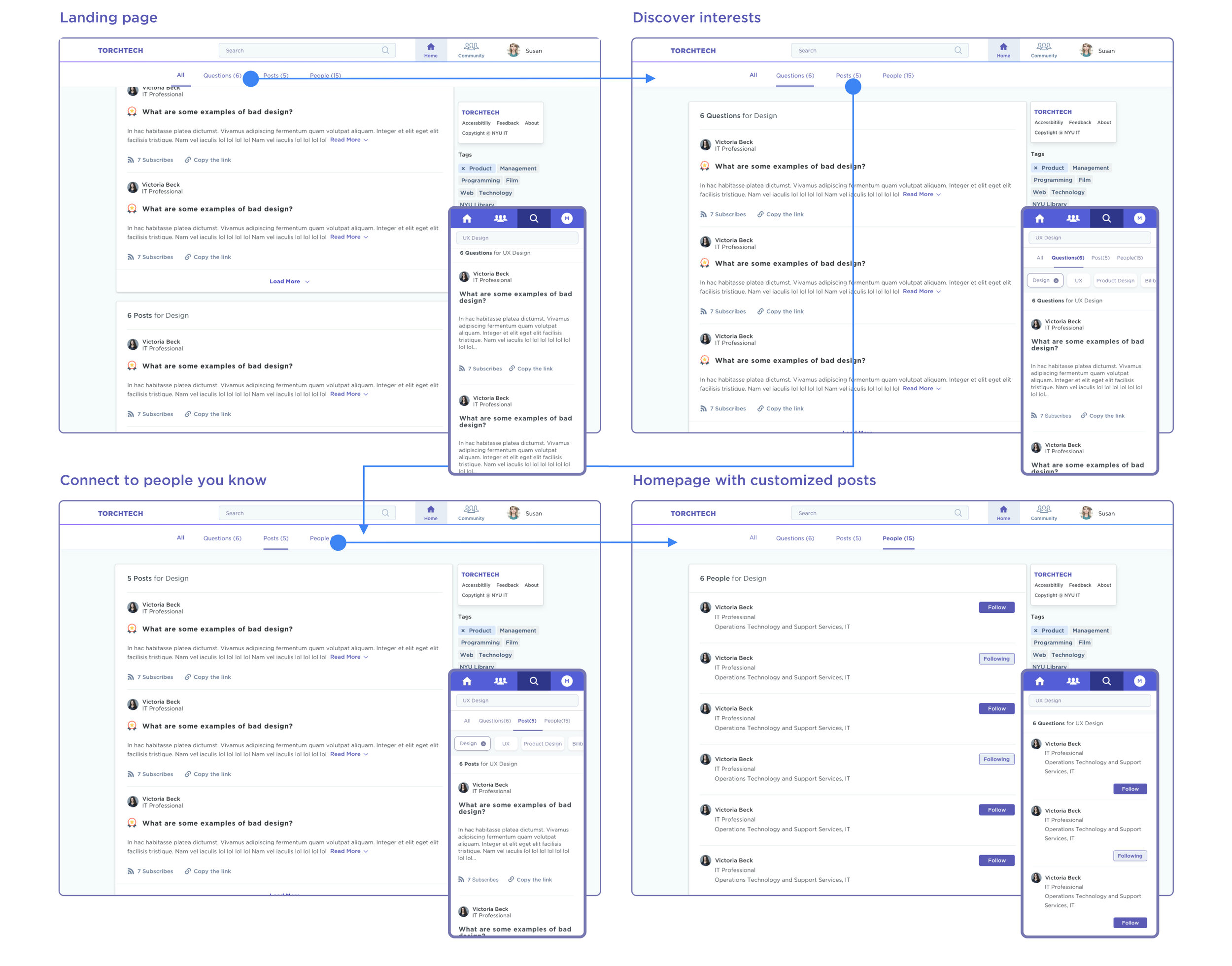
The onboarding process for users to choose their interested topics and connect with people they know when the user first logs into the system.

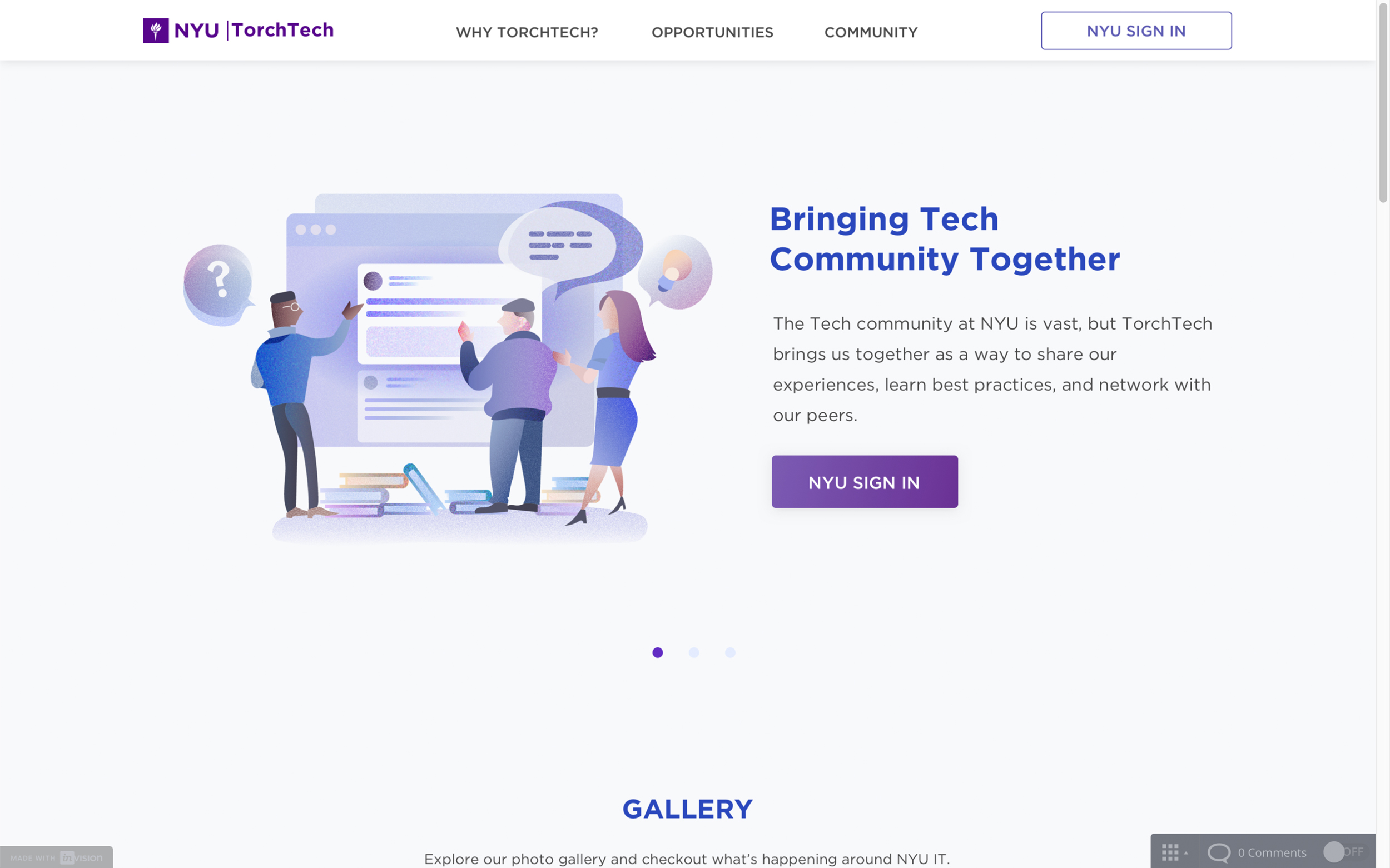
Knowledge-Sharing - Home Page
The essential purpose of this platform is to share knowledge and make a collaborative environment. The previous team and I have a more visual focus for the writing post section, which encourages users to share knowledge. If users interested in a question/an article, they can click the title to learn more. We also provide the “Discover” feature for them to explore more posts/questions out of their primary interests.

Community of Practice(CoP)
The Community of Practice(CoP) is another significant feature for VTT, the previous team and I decide to briefly provide CoP details in the Landing page(external site). Users can choose to view all CoPs, trending, or new CoPs. After they log in to the system, users can read more info of each community, including their members and community details. If users join the CoP, they can view resources, all members, and posts. Users can also have their CoPs by creating one.

Search Page
The search feature allows users to use the keyword to get the information they need in VTT. The result will display from three perspectives, which are questions, posts, and people.
Design Guideline
At the end of the design, I also created a simple design guideline to help the developer to generate the component library and bring the user consistent user experience.

Conclusion
After I finish the phase one’s design, we did a focus group, and the feedback is positive. however, the user still has some suggestions, like they still want the homepage to show the VTT’s recent event, and they also wish COP to have a place to for them to discuss the project. Through we already considered these problems after the focus group, but we also need to consider the limitation from the development team, so we decide to move it to the next phase. Another thing is the consistency and logic of the new design has a significate improvement from the last time’s usability testing, but some tasks completion rate still not good enough( ex: find the question and post subscribed before / find the people they connected back), we will try to figure out all these problems at the second phase design, and let development team join as soon as possible for the smoother development.
Project Thinking and Outlook
Next step
Currently, the development of this project was in the final phase of Phase 1. Meanwhile, I was already doing more research for Phase 2. For the next phase, this project would mainly focus on developing Network features and improving all features in Phase 1. Both quantity and quality research was needed to gain more feedback for the improvement.
Key takeaways
Collaboration brings more value in design culture
No matter how good the design process is, if there's no collaboration within the team, the work will not be efficient. Collaboration happens not just among designers, but also between designers, developers, product managers, and all related stakeholders. It brings different perspectives of the great ideas on the table.When I joined the TorchTech team, I was continuing all the design processes from the previous designers. In this case, the documentation was an important tool for collaboration. Even though I couldn't ask directly to the previous designers, but I could continue this project by looking at all the documentation. That said, creating the documentation accessible and easy to access will help the design process more efficient. Besides that, the communication between designers and developers is essential in designing the solutions. After all, everyone in a team owns the product, not just designers. It's important to make everyone bring up their ideas to create a better design solution.
Let developer join the development as soon as possible
After we present our design to the development team, we know there are so many things that need to improve before the implement. Fortunately, our development team is very kind and tell me how to create a comfortable development environment to help the development team to develop a complex project, and also we compromise on certain features of NYU VTT on phase one which allows the development of NYU VTT phase one more smoother. Through the plan of VTT, I learn the importance to cooperated with the development team, and I believe it can help the development of the project more efficient.
